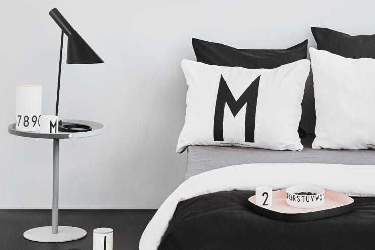
In 2009, former copywriter and journalist Mette Thomsen founded Design Letters. Based in Copenhagen’s Frederiksberg neighbourhood, it’s a brand that takes mid-century typography and applies it to homeware – all with that Scandi minimalist aesthetic; think handle-less cups and pillowcases featuring bold letters, trays lined with pastel colours and a more design-friendly take on children’s cutlery. We sat down with Mette to find out more about the collection and how Danish architect Arne Jacobsen inspired the brand.
Discover Design Letters on Coggles >>
- Question: How would you describe Design Letters?
-
Answer:
DESIGN LETTERS & Friends is playful and creative and likes to inspire people to create their own personal space. We insist on originality and love the small details that make us a little special.
- Question: You were a journalist before you founded Design Letters – what made you want to start the brand?
-
Answer:
I have always loved playing with words and I have actually also worked as a copywriter at an advertising agency. And since I was a little girl I have been very fond of interior design, so by establishing DESIGN LETTERS I kind of married the two passions in my life. Regarding the timing in 2009 I saw a gap in the market for stylish letters. At that time there were absolutely no “design” letters in the interiors world. DESIGN LETTERS was born to fill out this gap.
- Question: How has your background influenced your products and designs?
-
Answer:
It’s difficult to say. I follow very much my own intuition and taste and I have always loved simplicity and the power of a simple, but strong, idea. I am also very passionate about vintage design and I have been collecting vintage furniture and accessories since I was very young. So it’s no coincidence that a large part of our business is based on Arne Jacobsen’s typography from 1937.
- Question: What made you want to include Arne Jacobsen’s typography into your brand?
-
Answer:
In 2010 I asked myself if there could be any of the old iconic Danish architects who actually had designed typography and I started an intensive research to explore this. There I bumped into a hand drawn typography made in 1937 by Arne Jacobsen. The letters were originally made for the internal signage of Aarhus City Hall and I found the look and the story of this very simple typography extremely attractive. I was really excited about the idea of launching a collection featuring these letters, but at the same time I was nervous; what would the relatives of Arne Jacobsen say to my idea? Fortunately, the liked it and gave us the permission to revive the typography.
- Question: What’s your favourite way to style Design Letters’ pieces in the home?
-
Answer:
I like to mix our simple masculine black and white typography-collection with colorful vintage vases, flowers and books. Every year at Christmas time I also enjoy putting tea lights into our cups and write JUL (Christmas in Danish) on the table or in the windowsill. The cups are made of pure white Fine Bone China porcelain which makes them transparent when you use them as candlelight holders.
- Question: What can we expect to see next from Design Letters?
-
Answer:
We have just launched a series of cooking gear in melamine – a mixing bowl and measuring jugs. We are going to expand this collection so you can bring DESIGN LETTERS & Friends into the kitchen in the future.